IXDA is committed to improving the human condition by advancing the discipline of Interaction Design. To do this, they attempt to foster a community of people that choose to come together to support this goal. Diversity, inclusion, and equity are core values. The IxDA Seattle website has few featured images. The images that are included seems to be stock photos that do not match the website as a whole.
The goal for this visual system redesign was to emphasize the core characteristics of IXDA Seattle, which are fun, engaging, playful, organic, and to make their core offerings easy to find.
IxDA Seattle communicates with the greater community primarily through social media and announcements on their personal website. Links to their Facebook, Instagram, Twitter, LinkedIn, YouTube accounts are included on the IxDA Seattle website at the foot of the page. Graphic posters conveying events information and general opportunities are displayed at the bottom of the website as well as displayed on their major social media accounts.
02 / problem
Problem
IXDA Seattle visual system was dated, cluttered, and lacked excitement. It was difficult to understand the difference between their two navigation systems and their core offerings where not clearly emphasized.
The Challenge
How might we create a fun, engaging, playful, and organic visual design system?
Design Goals
1. Embody the core characteristics of IXDA Seattle throughout all components of their visual design system. 2. Clearly emphasize primary products and mission statements on the home page. 3. Diversity, inclusion, and parity are core values that convey a sense of professionality and trustworthiness of IXDA as a community in the interaction design industry.
03 / Moodboard
Visual Design Focus
Digital, Marden, professional, heart-warming through employment of refreshing colors, no-geometric shape, and an imagery collection relevantThe two inte to the topic.
04 / Logo
Logo
The two interacting lines form an X, which also resembles the shape of DNA, symbolizing the integration of interactive design into our DNA.
05 / Typography
Typography
Hero text and H1 are the san-serif type-face Quarto, most recognizable as the title font from the well-known design agency and firm, which lends to its modernized vibe. Its humanist shape helps convey an organic feel, appropriate for a website about professional organization. It is complemented by another san-serif, Helvetica Nee.
06 / Color
Color
The color palette is minimal to focus on the content and imagery and still keep the original theme color. The color palette is trying to relate to the core value, which is modern, virality, gentle, approachable. Important information or sections to call out are highlighted in the right, yellow and blue.
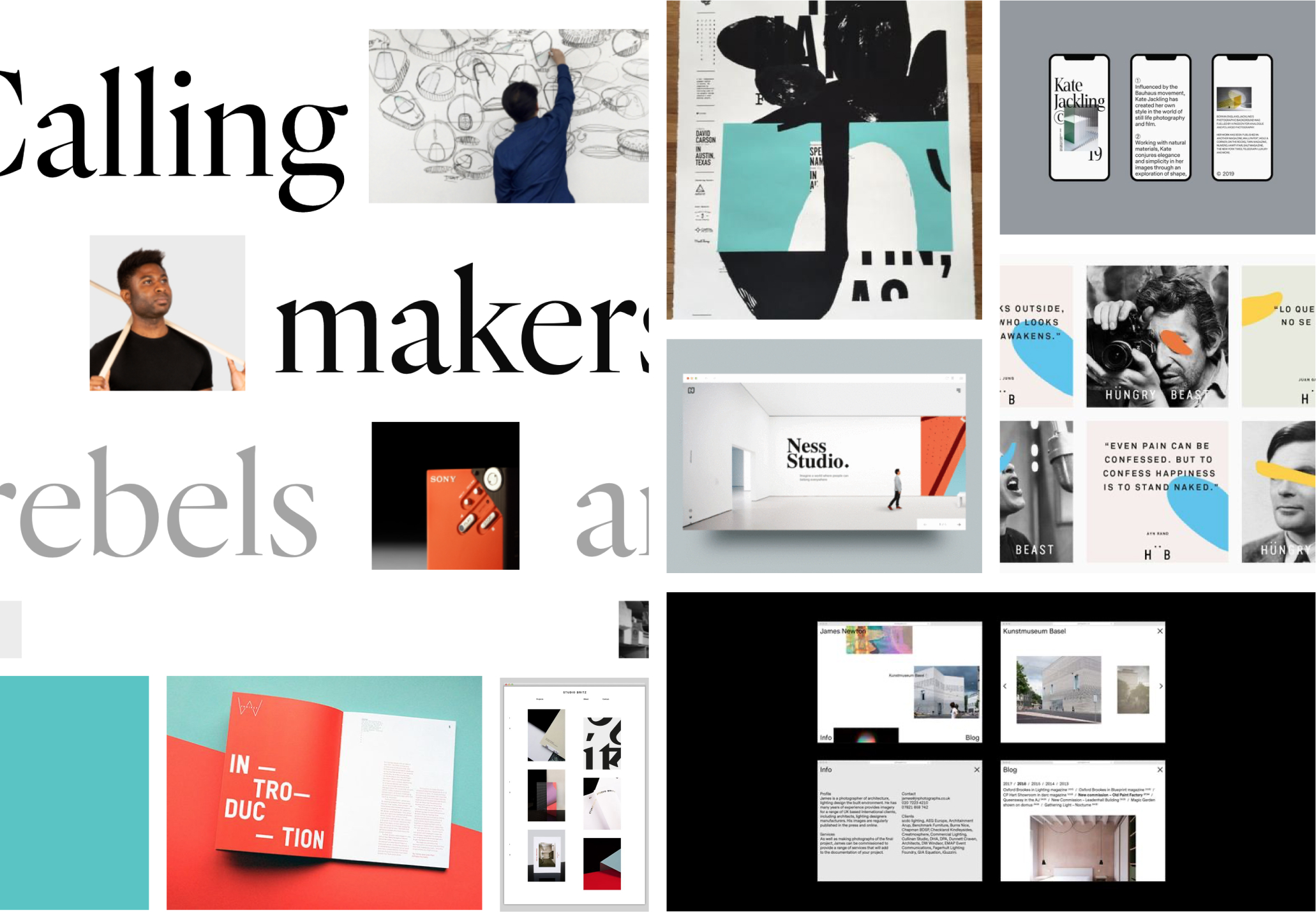
07 / Imagery
Imagery
Images should show off the digital, Morden, professional, heart-warming of IxDA Seattle through the employment of refreshing colors, no-geometric shape, and an imagery collection relevant to bringing the modern and design spirit.
08 / Solutions
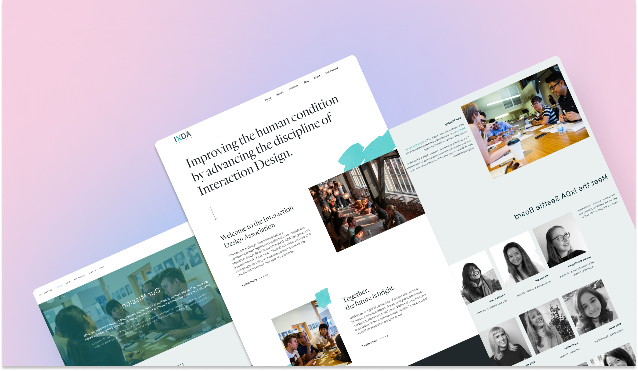
Design Solutions
The final outputs demonstrate how the redesigned visual system scales across formats — from the responsive homepage and about page to print materials — ensuring a cohesive and elevated brand presence.
IXDA is committed to improving the human condition by advancing the discipline of Interaction Design. To do this, they attempt to foster a community of people that choose to come together to support this goal. Diversity, inclusion, and equity are core values. The IxDA Seattle website has few featured images. The images that are included seems to be stock photos that do not match the website as a whole.
The goal for this visual system redesign was to emphasize the core characteristics of IXDA Seattle, which are fun, engaging, playful, organic, and to make their core offerings easy to find.
Tool Used
Figma
Team
Cindy Huang Yi Ching Hsu Li Shao Han
Timeline
12 weeks
01
CONTEXT
Communication
IxDA Seattle communicates with the greater community primarily through social media and announcements on their personal website. Links to their Facebook, Instagram, Twitter, LinkedIn, YouTube accounts are included on the IxDA Seattle website at the foot of the page. Graphic posters conveying events information and general opportunities are displayed at the bottom of the website as well as displayed on their major social media accounts.
02
PROBLEM
Problem
IXDA Seattle visual system was dated, cluttered, and lacked excitement. It was difficult to understand the difference between their two navigation systems and their core offerings where not clearly emphasized.
The Challenge
How might we create a fun, engaging, playful, and organic visual design system?
DESIGN GOALS
Embody the core characteristics of IXDA Seattle throughout all components of their visual design system.
Clearly emphasize primary products and mission statements on the home page.
Diversity, inclusion, and parity are core values that convey a sense of professionality and trustworthiness of IXDA as a community in the interaction design industry.
03
Moodboard
Visual Design Focus
Digital, Marden, professional, heart-warming through employment of refreshing colors, no-geometric shape, and an imagery collection relevantThe two inte to the topic.
04
Logo
Logo
The two interacting lines form an X, which also resembles the shape of DNA, symbolizing the integration of interactive design into our DNA.
05
Typography
Typography
Hero text and H1 are the san-serif type-face Quarto, most recognizable as the title font from the well-known design agency and firm, which lends to its modernized vibe. Its humanist shape helps convey an organic feel, appropriate for a website about professional organization. It is complemented by another san-serif, Helvetica Neue.
06
Color
Color
The color palette is minimal to focus on the content and imagery and still keep the original theme color. The color palette is trying to relate to the core value, which is modern, virality, gentle, approachable.
Important information or sections to call out are highlighted in the right, yellow and blue.
07
Imagery
Imagery
Images should show off the digital, Morden, professional, heart-warming of IxDA Seattle through the employment of refreshing colors, no-geometric shape, and an imagery collection relevant to bringing the modern and design spirit.